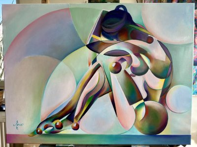
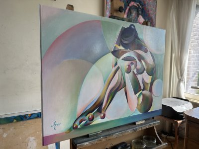
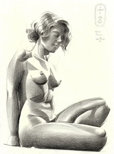
Neo Deco – 10-08-23

(0)
0 654
£4,740
In Stock
Unframed

One of the Best

This oil painting ‘Neo Deo – 10-08-23’ follows a day later after my drawing ‘Nina – 09-08-23’. Two projects almost finished at the same time. That’s how it goes sometimes. I always have both an oil and a drawing in progress. Not that this oil took a long time to paint. The invention of the idea I already got back in 2014, becoming ‘Roundism – 21-11-14’. It was all about executing it in oil. The waiting list is long. So many drawings and so little time to paint them all. Consequently I pick out the ones I think are the best. The graphite drawing came early in the style and probably was the first one I really was content with. It oozes out art deco completely but also bears my mark.

The Right Color Scheme

In these kind of projects it’s all about finding the right colour scheme. However,  one has to reboot the composition once in a while. Not for this one, at least not too much. I consider it already to be great, even though I haven’t sold it yet, despite the sale of many prints. No, really it was all about a suiting color scheme. When it comes to this, it’s not about rational consideration but all about soul searching really. As an artist I am trained to let it all come to you instead of trying to grasp creativity rationally. For no particular reason the color blue entered my mind. Not the regular kind but an old kind of blue, something out of a 1920s scenery.

Blue, Pink and Green

Blue became the first colour I employed and soon I had visions of ‘old pink’ colours in the nude. Could it be magic at this point? Not really, I already had this scheme going in my ‘Rusalka’ oil. I don’t mind though. It seemed to work in this particular case. On top of that I added some more green. Next to that, I pulled a trick I played in my recent ‘Neo Deco – 04-07-23’. In that one I differentiate the colors of the linear structures. As to this painting, I made all linear structurs inside the body pinkish. That, in order to have them contrast with the lines outside.

Complementary Within a Colour

Just like in Rusalka, I employed different kind of blues. There are red blueish colours like utramarin and also greenish ones. The red and the green inside the positive form take care of complementary violence, hence vividness. The different hues of blue in the negative space take care of subtlety. Can you see it? Last but not least, using red, green and blueish colors I had someone like Anthony van Dyck in mind. His portraits almost have this kind of mother-of-pearl appearce to them. If you look closely, you can see greens shimmer through the pink colors in the final layers. I had it in my mind to do exactly that in my own painting. Not by glazing reds over greens but placing them adjactent to eachother. That was my very aim. You cath my drift?

Oil on linen (60 x 80 cm)

Artist: Corné Akkers

Style Geometric
Subject Nudes and erotic
Year created 2023
Size (L x W x H) (cm / inches) 60 x 80 x 2
Signed Yes
Shipping Cost Free Shipping
Shipping Time Ready to ship in 4-7 Business Days
Location Roggekamp 579 2592 XA The Hague, South Holland, Netherlands

No reviews found.