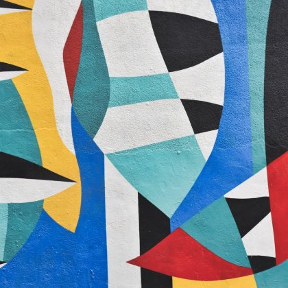
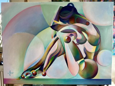
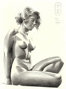
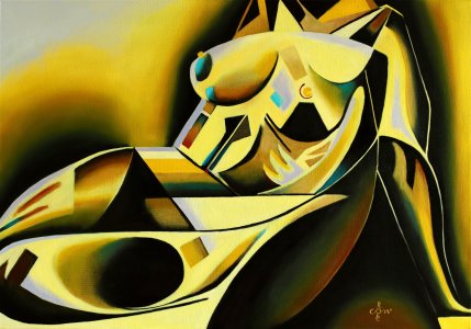
This pastel drawing Golden Night – 08-02-21 is based on a previous graphite pencil drawing Roundism 10-08-20. What I do is to browse through my collection of drawing and just pick one to execute in color. For some reason people seem to like the concept of Roundism – 03-01-16 (sold) very much. Its continuation in pastel Golden Roundism – 03-03-21 gained equal admiration. Surely all things round and voluptious are attractive in the eyes of both male and female art lovers. However, suiting such preference certainly would cramp my style indeed. I am a stubborn kind of artist. If someone likes something about me, I will do the opposite. Rebel without a pause.
Now seriously. I just want to explore my ideas in each and every direction. Roundism – 10-08-20 I always thought to be a succesful execution of an initial good idea. It was obvious to me I had to go back to my original interpretation of my spherical cubism. Some days back on Reddit I explained my sort of cubism is not to be compared with traditional cubism. It has to be called multi-perspectivism really. I would consider mine a more pure cubist styling without putting a distortion of perspectives in the mix. Hence, my cubism is real cubism rebus sic stantibus.
There is a certain comfort in redoing old themes I must say. Composition and tonality are just to be copied on a larger scale basically. It is not in the invention of the idea but, as stated before, color is the main driving force now. Was the previous pastel based on the use of unsaturated colors, this one became different. The idea was to use a lot of greyish pigments on a grey Pastelmat sheet. That’s because I had a box of Koh-I-Noor Hardtmuth grey chalks (Set 095) I wanted to use for a change. In the highlights I then would refer to the golden theme and use an array of yellows. In the light of this choice lies the theory of simultaneous contrast. All things gray would appear to look purple. I was mistaken though.
The gray surpassed the yellow from a quantitative point of view so it stayed gray. So I shifted to higher gear. In the reference picture I took during the session I saw there were two different light source. There was the sidetable lighting at the left and the blueish light coming from the right. Because my model’s body also showed orange and pinkish hues at the left the blue hues at the right were badly needed anyway. In order to tune down saturational levels I made a hugh portion of the pastel darker. The result is 5 colors from the color wheel (except for pure red). Green is less so it does not play a grand part. They are not screaming though because I subdued them and let them do my bidding: harmonisation.
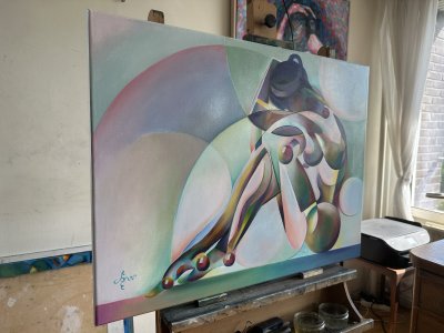
Pastel drawing on Clairfontaine Pastel Mat paper (69.4 x 49.8 x 0.1 cm)
Artist: Corné Akkers
| Style | Geometric |
| Subject | Nudes and erotic |
| Year created | 2021 |
| Size (L x W x H) (cm / inches) | 49.8 x 69.4 x 0.1 cm |
| Signed | Yes |
| Shipping Cost | Free Shipping |
| Shipping Time | Ready to ship in 4-7 Business Days |
| Location | Roggekamp 579 2592 XA The Hague, South Holland, Netherlands |
No reviews found.
 English
 Français