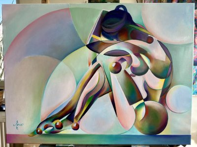
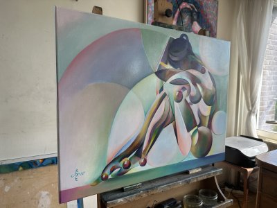
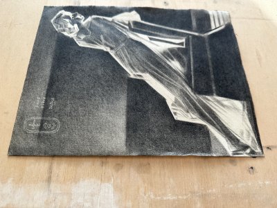
This painting in the Golden Series was designed to give the spectator a most intense ‘yellow’ experience. You see, my pastel painting ‘Golden – 28-01-21’ was next in line to be worked out in oil paint. That one was an elaboration of a previous graphite pencil drawing ‘Roundism – 31-03-20 (sold)’. So this motif after two years went full circle with the completion thereof in oil.
Bling-Bling
At the same time it seems also part of the Solarization series but the Golden Series was more appropiate. Sometimes I have these classificational problems. For that matter I also could have classified it in the Roundism series. I guess that is how things turn out for an artist. You fool around with the theme and the execution causes variation in time. In fact I like the final result of this search. This oil has certain elements of all series in it and I even like the color scheme. It’s like Roundism on acid: fully bling-bling and almost radiating. Not the radiation by Mondriaan through brush strokes directed outwards but almost intrinsically.
Addition to the Mix
The challenge I put myself was to add something to the mix compared to the pastel. The motif is not that hard to transfer onto linen. I get bored easily and I certainly don’t want to get away with sheer copying, even my own motif. Consequently I came up with the idea to use light lavender in the highlights so the painting didn’t feel monochrome. After all, one color is no color. However, I really wanted to have the yellow jump out this time. The only way to achieve that is by placing all things yellow to different colours. It’s all about contrast. One can only detect massive quantities of yellow set off against the places where it’s not, don’t you agree?
Luminism
In a later phase I extended the color palette to cyan and red, thinking of luminist painter Herman Gouwe. The trick is to use this luministic palette to the max. In general it has become a yellow painting subdued by lavender patches. Here and there I placed some reds and cyans to tickle the eyes even more. Where the yellow and purple are placed adjacent I tuned down the chroma of both of them. This way they would perfectly match in the highest tones. Through the reds and cyans the paintings almost seems to refer to my previous oil ‘Anaglyphical Roundism – 12-05-22’. In the thy and breast I layed patches of golden brown. I got that from mixing Old Holland Yellow Brown, Italian Brown Pink Lake and Mussini Renaissance Gold. They reminded me of the beautiful colors of Alain Delon’s Maserati and Romy Schneider’s tan in ‘La Piscine (1969)’.
Almost Abstract
The strangest thing happened to me when I was throwing in final details and I was painting up close. With my nose close to the surface it looked like a mighty fine Miro or Klee. Then it hit me: I got two sorts of paintings. One is a shiny nude, the other is a landscape of abstract forms of different hues and tones from upclose.
 English
 Français