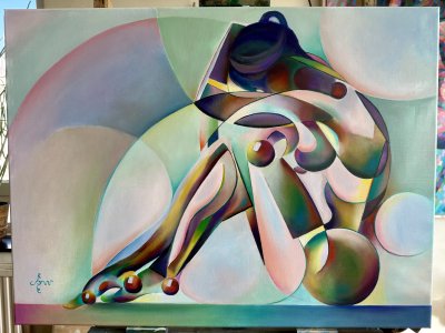
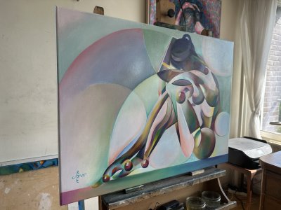
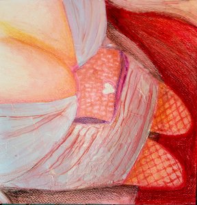
Golden is my new project I finished just ago. I thought it was time to extend the Golden series with another oil paint. Golden – 18-05-22 was the last one and I didn’t know what forms to solarize and to style cubistically next. I remembered I made some realistic and impressionist pastels of my regular model years back. Surely I was inspired by her golden skin and it shows in those pastel drawings. This series call for realism finally.
Simply Nude
This having boldly stated it takes me back to a discussion I had on Facebook some time ago. An American women told me she adored my nude in Slava Ukraini – 18-04-22. Beautiful were it not for those horses I put into her bodily features. That wasn’t necessary she said. I replied I wouldn’t waste a perfect linen to a meaningless nude. Until now I found these kinds of themes a bit exhausted but maybe I have to change my mind. I even regret that statement a bit. Regardless of my endless imagination and capabilities to depict whatever is in front of my mind’eye, plain nude is okay. And why not? Would we dismiss Rembrandt’s Bathsheba or Velázquez Rokeby Venus because of their nudity right in the face?
Yellow Screams
So maybe after all not an exhausted theme, at least not for me. In fact I hardly have painted realist ones I think. Except for aforementioned Risque oil the last one was 10 years ago: Chinese Nude (2012) (sold). I recall having fun doing that one. Yellow is such a difficult yet rewarding color. It tends to scream in relationship to other colors. So, why not let it dominate anyway and skip most other colors? It also gave me the opportunity to celebrate the exceptional beauty of my regular model’s skin complexion.
Unforgivenly Realistic
The reference picture I chose was taken by me years back in her home. Not a live session this time but the photo was that great so I didn’t need to see her live. I decided to depict every little irregularity and small wrinkle on her back. No much fun to paint skin very smoothly anyway. Beginners often make the mistake to paint skin complexion smoothing it out like smooth marzipan. The razor light running across her back guided me, disclosing each and every little dimple and crack unforgivenly. The left side and her left shoulder part I painted much more reddish. Proof of the fact that color of skin is just an illusion, subject to change. In fact these are shadowy parts and the yellow parts are directly lit. The highlights I did in purple in order to let it complement all things yellow dramatically.
Flowery Plaid
Enter the flowery plaid. I was reluctant to do all the flowers. I remembered having read about Ingres’ painting of Madame Moitessier. Her flowery dress must have cost him quite some time to complete. Therefor the first set-up of the plaid was done in an impresstionist way. It didn’t work out though. That is why I spent the entire Sunday (yesterday) to throw the flowers in. Especially the harsh linear structures contrasting the smootness of the skin was deliberate. It also reminded me to Klimt’s sutble nudes girded by contrasting decorative patterns. The cramp in my right hand is gone now.
 English
 Français