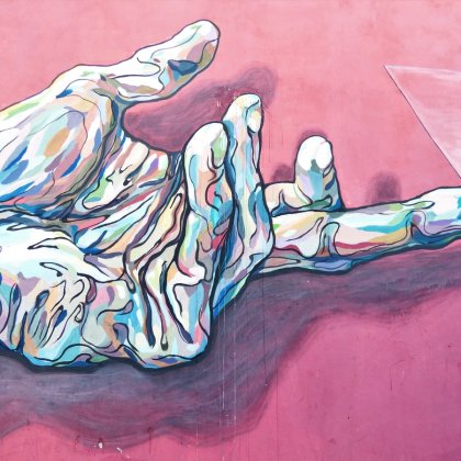
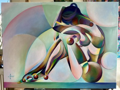
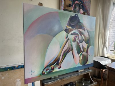
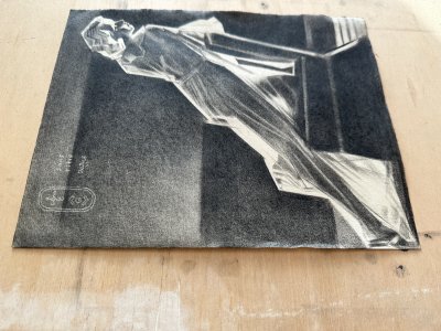
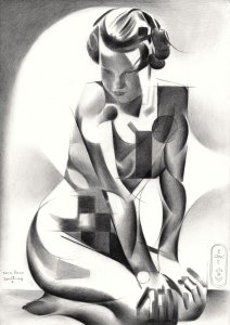
Blue Velvet is my next one after the more comprehensive work on Geesje Kwak. Time for an elaboration of a previous drawing Solarised Roundism – 01-07-22. Not named after the movie but rather a reason to unleash my satin fetish. Not entirely coincidental I happen to have some of that fabric in my studio. It suits my regular model’s skin complexion quite nicely. You certainly agree with me that all things blue complement her orange ocres in a most smashing way. This is not my first project concerning solarisation in oil. Last one was Solarized Roundism – 07-03-22. It sort of kept lingering on in the back of my head I had to do another one. Not a cubist one or in my roundism style. As to fabrics in general, I share my love to depict them with people like Gabriël Metsu and Jan van Eyck.
This time I wanted to sort of have the process of solarization take over. Let its styling create the magic on my behalf. We artists often are faced with artistic challenges. What to do next? How to come to an attractive idea to put on linen? I guess the whole world is looking for a great idea or to steal it from those who found one. That is why I turn to accidentalism regularly. This time I simply let my image editor GIMP fool around with the curves in some of the session pictures I have of her. Surely such satin fabric when solarised would deliver me incredible bling-bling effects. So it did and I started from there. Furthermore I abstracted the folds just the level of recognizability. There are elements of roundism to be found but this time assisted by computerized algorithms.
The challenge also was to put solarisation into color. Normally created by overexposure photographts to light it is best shown in black and white. I wondered how an attractive color scheme and solarization combined would look like. The most saturated parts of are painted with YInMn paint, also known as ‘Oregon blue’. Other blues I use are Old Holland Dark Blue and Rembrandt Phtalo Blue Reddish, just to give it some variety. All this blue violence needed saturated warm pigments in the skin. I kept a slight rough edge in the complexion in contrast to satin slickness. As to the background the initial idea was to keep the underpainting: Perylene Black mixed with Titanium White. Later I found out the hefty colors in the main theme needed some counterbalancing in the negative space.
This painting is also meant as a support for women of color. Let’s stop calling them ‘black’. That is not a color. Why is the Woke movement so fond of naming people as such? White folks aren’t white either. I guess only artists understand me immediately. Colorful is more accurate, let alone more pleasant to the ears and eyes. Let my oil painting be the judge of that. In this respect the result looks rather expressive, even expressionist. Therefor I consider it deliberate, even urgent. So much for Woke!
Oil on linen (70 x 100 cm)
Artist: Corné Akkers
| Style | Expressive |
| Subject | Nudes and erotic |
| Year created | 2022 |
| Size (L x W x H) (cm / inches) | 70 x 100 x 1 |
| Signed | No |
| Shipping Cost | Free Shipping |
| Shipping Time | Ready to ship in 4-7 Business Days |
| Location | Roggekamp 579 2592 XA The Hague, South Holland, Netherlands |
No reviews found.
 English
 Français